Five Typefaces That Ruined the ’70s
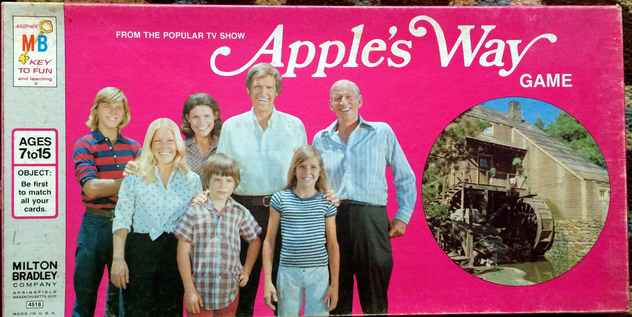 The other day someone in one of the Facebook groups I belong to decided to post this odd bit of ephemera (if a board game can be considered such) from a short-lived TV series called “Apple’s Way,” a production by Earl Hamner Jr. of “The Waltons” fame. I have zero recollection of the show other than that it existed; nevertheless it set the match to an anger kindling deep inside me, as I again remember how the typeface Bookman Swash ruined the ‘70s. And it wasn’t the only typeface that deserves some of the blame for everything bad that happened in that mixed-up decade.
Let’s be clear: there are no bad typefaces (okay, well, there are some). But there are bad applications of typefaces, and there are trends of overuse of certain typefaces. In an age when the universe of people with access to type was vastly more limited, and when there was only a handful of foundries producing new designs for the very select machines that were available for setting type in the cold type days, designers had comparatively fewer options than today. They also seemed to be quicker to pick up trends, some might say to copy, and for someone who was actively setting type in the ‘70s and ‘80s, it is often possible to date a piece of printing within a year or two just by looking at the typeface.
Some typefaces (I haven’t yet given up on the distinction between a typeface and a font, which is a typeface in a particular point size, a lost battle though that is) were used so much, and often in such inappropriate applications, that it’s fair to say that they characterized the ‘70s, and not in a good way. Each of these five typefaces was extensively used by the laziest of copycat designers, and really helped to ruin the ‘70s.
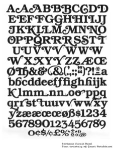 Bookman Swash
Bookman is a venerable, readable, simple oldstyle face, not particularly suited for text but useable for advertising and trade printing. While it goes back into the 1800s, it first went by the name Bookman in 1903, released by American Type Founders. But in 1975, International Typeface Corporation (ITC), as part of a general campaign of ruining classic typefaces by “updating” them into sometimes horrible revisions that satisfied the modern desire for fatter characters and higher x-heights, had designer Edward Benguiat design ITC Bookman. And with that, came Bookman Swash.
Now, it appears there had been swashes for Bookman before — but in the hot type days, selecting an alternate character was difficult work and a deliberate choice. They rarely bothered anyone, because you could really only use them for titles. In the early phototypesetting days, they were still hard to access and limited in use. But around the time of this redesign, phototypesetters were getting vastly more sophisticated, even computerized to some extent, and choosing alternate characters and ligatures was getting easier, letting designers start to make some horrible choices. Some weren’t afraid to ask the question, “What if EVERY character had a swash?!” The answer: you’ll be living in the unreadable ‘70s.
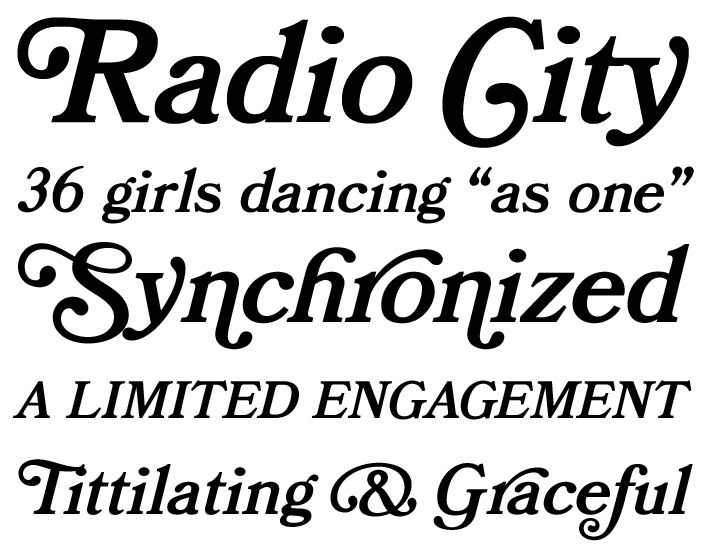 It was meant to imply something homey, old-fashioned, and comfortable, and there was a weird fad for the old-fashioned in the ‘70s, so it fit right in. I don’t know if this example is something that was actually produced, but it shows what happens when you decide to have your type say “HEY LOOK AT ME” instead of conveying the message it’s supposed to.
 Peignot Bold
On the one hand, you know this ubiquitous typeface from the Mary Tyler Moore Show titles, a perfectly effective and appropriate use. On the other hand, we had local convenience/dairy chain Stewarts using it as a text face, which it is not.
Peignot was a French typeface from 1937, designed by the famous poster artist Cassandre. As you can see, it’s perfectly fine. It is also only capital letters, making it somewhat limited in application. Rather, the lower case has a selection of letters that look like traditional lower case; the rest look like upper case, but carry a lower x-height. Good for some logotypes and titling. That is it. In the 1970s, Peignot underwent an insane revival. It was used everywhere: product logotypes, book titles, advertising headlines.
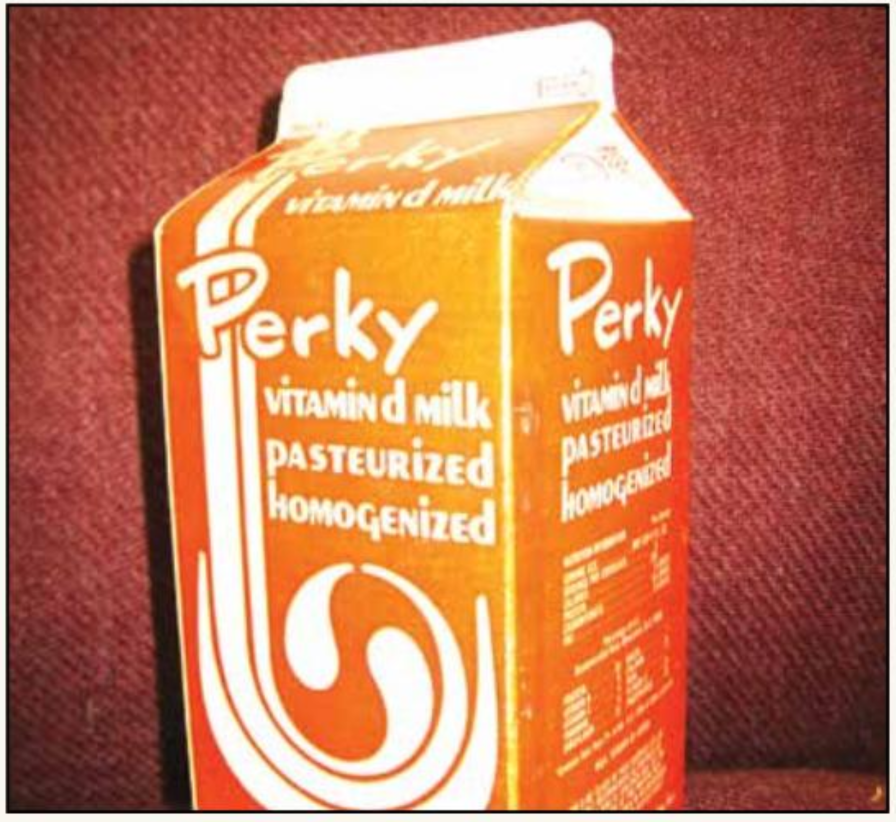 And where I grew up, it was used by the aforementioned chain store, for everything. Everything. All labeling, all in-store signage, milk cartons, everything. All words were in Peignot. They were hardly the only abuser of the typeface, but they didn’t help things. (They later replaced it with a horrible, also caps-only, brush face.)
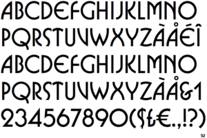
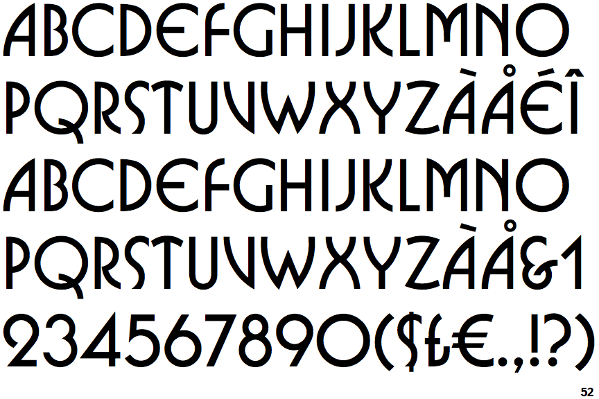
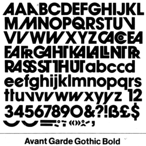 Avant Garde
This is a Herb Lubalin ITC font that perhaps defines the ’70s. He designed it as the logotype and cover face for the magazine Avant Garde. It was everywhere, all the time. There is nothing wrong with Avant Garde, per se, but it has some alternate characters that designers felt compelled to use because they were just, so, avant garde. Allow me to correct that: it has many alternate characters. too many for ’70s designers to be trusted with. EVERY CAPITAL A DOES NOT NEED TO SLANT TO THE RIGHT, CREATING A GAPING HOLE IN YOUR TYPOGRAPHY. Abused, it defied the principles of good kerning, and oh boy was it abused. Even its own magazine couldn’t resist showing off everything the typeface could do, sacrificing legibility for “hey boy howdy lookit this now.” It was supposed to be arty and show what you could do when just designing with type. It also showed what you can overdo.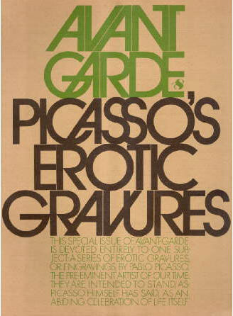
 Busorama
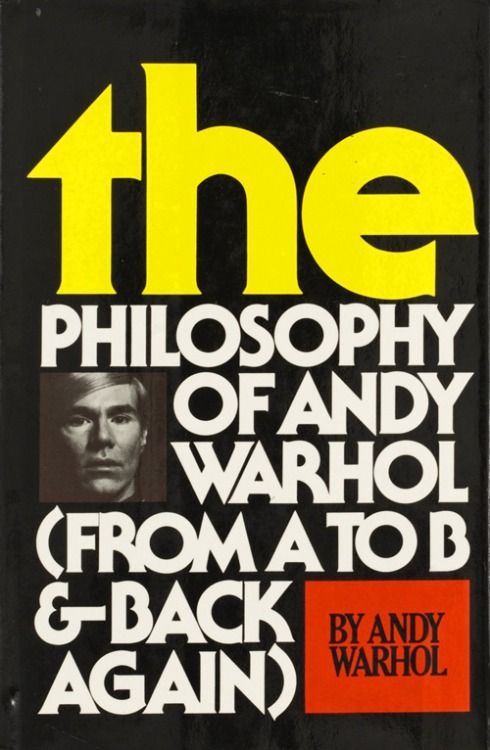
Like Avant Garde, but hippier dippier. This was one of the first ITC faces when they went on a spree determined to ruin every classic typeface there ever was, although Busorama was an original design. Current owner Linotype says “Busorama melds Art Deco and 70s flower-power into a delightful sans serif design. Designed by Tom Carnase, this three-weight sans serif family still turns heads.” Again, there is nothing wrong with it per se. It belongs on album covers and cosmetics logos. Perfect. It’s when you start composing sentences in it that YOU DO REALIZE THIS IS AN ALL CAPS TYPEFACE, DON’T YOU? Even before the modern interpretation of caps as shouting, setting type in all capital letters was known to slow reading comprehension, and even more so when the characters were funky. A word, two words, short sub-heads – these are all good uses of Busorama. But even the limited amount of text on this book cover starts to stretch the bounds of legibility of this typeface (and it isn’t helped by the trendy crash-kerning).
 Souvenir
I don’t think I can properly express how much I hate Souvenir. It may be irrational. You may not agree. It’s okay for you to be wrong. Again, this was an older typeface developed by ATF back in 1920, and then revised and revived by ITC’s Ed Benguiat in 1970. Sort of light and curvy and non-traditional without being completely illegible, it seemed to gain rapid favor as a text face by designers who couldn’t wait to get away from the “old-looking” Caslons, Baskervilles and Garamonds whose use, despite centuries of success, would label them as hopelessly out of touch with the times. Every character is just a little bit soft, a little bit odd – rounded W’s, snipped tails on the g’s, b’s whose backbones don’t touch the ground. Souvenir is just a little too light and quirky, and a little too damn even, and the result is a page that is light gray, not terribly interesting, and not exceptionally readable. It is not bad. It is not good. But again, every designer who wanted to do something a little different did it with Souvenir. When I arrived at my college newspaper, the nameplate of that venerable institution was set in Souvenir, the least inspiring flag of all time. Why was it in Souvenir? Because we had a very limited set of headlining fonts available to us on the Compugraphic 7200 headliners we used. When I changed the flag to a version of Trooper Roman (no, I can’t defend my 19-year-old self), we had to buy an additional type ribbon at a fairly crazy cost.
 Bonus: Cooper Black
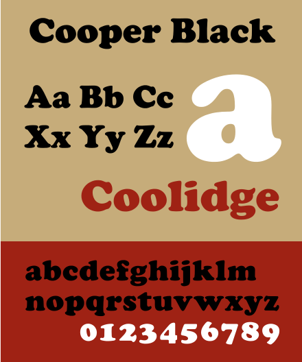
It’s probably not fair to say that this typeface, released way back in 1922, ruined the ’70s, so I won’t count it among the five. But there is an odd way in which it defined the ’70s, and not just because it was used for television show logos (“The Bob Newhart Show,” “Diff’rent Strokes) and many album covers. It’s because it was the only typeface that appeared on custom-made T-shirts. In every mall in America, there was a t-shirt shop that would put just about any saying you would like on a T-shirt. Rather than screen-printing, they did it with iron-on letters. They’d line up your saying over a shirt, press it with a giant clamping iron, and out came a steaming (and usually slightly misaligned) custom T. Every one of those iron-on letters was in Cooper Black. (Think “Vote for Pedro.”) And everyone had one, or two, or five. Today it’s making a comeback – though usually through screened mass-production shirts, not the slightly thick, sometimes fuzzy heat transfer letters used in the ’70s.
Just my thoughts, mind you, based on having lived through, and set type during, that nutty decade. Again, nothing wrong with any of these typefaces themselves – but there were some horrible uses and overuse of each of them. When it comes to typography, this is the most important lesson designers can learn:

These bring back memories! It’s so funny to see these again. Thank you for sharing!
These were delightful typefaces that embellished and helped define the 1970s! They should be celebrated, not criticized.
I didn’t criticize the typefaces. I criticized the lazy designers who wildly and inappropriately overused them. “But there are bad applications of typefaces, and there are trends of overuse of certain typefaces.”