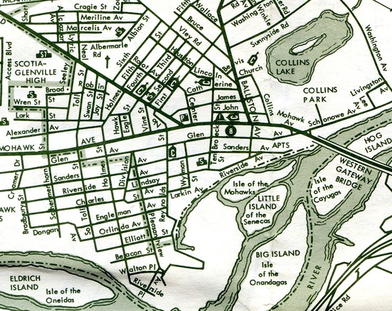
Map of the World, 1977
That whole section of the village below Mohawk Avenue down to the river,
I knew so intimately. I knew every house. I knew who lived in most of
them. From various sales activities, back in the days when kids went
door-to-door selling greeting cards, candles, and other tchochkes, I had
knocked on most of those doors. I knew where to go to find horse
chestnuts, which old lady would pay you to clean up all her acorns. I
knew every dog, in a day when almost no dog was leashed. When I go back
to Scotia today, I still remember the houses by who lived in them in the
’60s and ’70s. Every school I went to is on here (except the seventh grade building, the original Scotia HIgh School, closed and perhaps demolished by this time). I set foot in most of those churches at one time or another, too, though I never caught fire in any sense of the word as far as church went. This is truly a map of my world.
It wasn’t quite a case of “beyond here be monsters” — I was no stranger
to the wilds of Schenectady, or the hills of Glenville. But on most
days, most of the time, these little angled grids of streets, a couple
of square miles of homes pushed up against the Mohawk River, represented
everywhere I was likely to go.
The map is odd. It aggressively ignores the numbers of the state
routes that run through the village (5, 50, 147), while naming the
unreachable islands of the river. It announces “APTS” at the east end of
Sanders Avenue, as if apartments were such an odd feature they needed
to be pointed out; they weren’t a big feature in Scotia, but there were
others, and they would hardly rate special mention on a map that didn’t
name churches or most schools.
It would be hard not to note how primitive the cartography is. That wasn’t unusual for the time. It’s single-color printing (oddly, not black). I don’t know the technology used for creating these, but the type looks like some form of letterpress. No key to the symbols is given, but ‘F’ is firehouse, ‘C’ is church, ‘S’ is school and ‘P’ is post office. The ‘8’ was a bit of a mystery, but the index reminds me that it was the Glenville Town Hall, back when it was still in the village. The village’s sole public cemeteries are
marked with what looks more like a telephone pole than a cross, but
then using a cross to designate a cemetery is a bit presumptuous anyway.
Within a few years, much more colorful and better printed maps would start being printed, and the local map company would have to up its game.
